A font that can write in cursive
When we started our writing project at the Istituto Comprensivo di Terranuova Bracciolini, in Arezzo Italy, the idea was to write everything by hand. However, we realized that producing by hand all the necessary materials was impractical. So we decided to make Italica, a digital font.
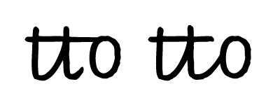
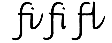
The letter shapes in the font are the same as those in Monica’s basic handwriting model. There are no decorative or personalized elements. In addition, we avoided any shapes which were too difficult for children in the early stages of learning to write in cursive writing. This studied simplicity, ideal for early learning, will allow children to develop their own personal style later on.
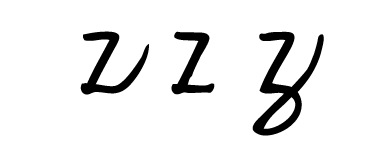
For example, if we look at the letters b, h, and l, we see that they don’t have entrance strokes and ascending loops. The reason for this is that our model has the simple rule that joins are either diagonal or horizontal. This said, some children might develop loops in their handwriting as they personalize it.
Important details: we added a serif above and below the capital letter I to avoid confusing capital I with lower case l. The capital letter J received similar treatment, so these two capital letters are distinctive and easily recognizable.
Another characteristic feature of the Italica font regards the numbers. In particular, the number seven does not have a horizontal bar on the stem because it is unnecessary and is not usually found in cursive writing or in print. However, it may be introduced if the teacher feels that, without it, 7 might be confused with 1.
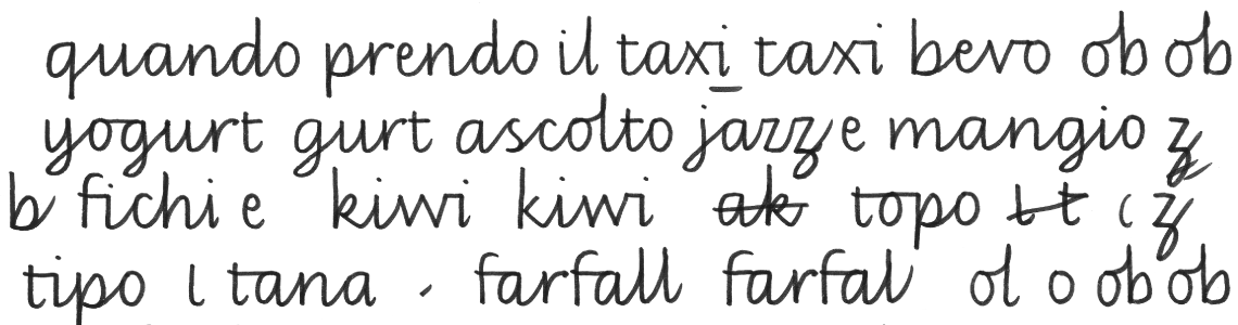
While we were constructing the Italica font, we wanted to reproduce the naturalness of pen-strokes. We did not correct or perfect any letters. Instead, we kept the little irregularities created by the ink as it is deposited on the paper. If you look at the font letters through a magnifying glass, you can see that their outlines are not precise and their right angles are not sharp. Rather, they are a bit jagged and irregular, like those written by hand on paper.
The idea of using a font to teach writing might seem contradictory.
We know that children copy and imitate, so if adults don’t pass on a love for handwriting, children won’t learn it. Our font is not meant to replace the teacher’s handwriting; the two are meant to work together and complement each other.
Anyone interested in purchasing Italica is kindly requested to contact us directly. We are interested in its dissemination in teaching and its use in children's publications.