


Handwriting versus typographic uniformity
Creating a font which reflects handwriting has always been a hard job. The serial uniformity of mechanically and digitally printed characters precludes the freeness of handmade strokes with all their quirky little imperfections. Until recently, the naturalness of handwriting has been excluded in the mechanical repetitions of typographical print.
Over the last ten years or so, OpenType characters have become available on the market. Some of these feature advanced, special effect typographical functions which are useful in constructing calligraphic alphabets. These effects can make typographic characters which are designed to mimic handwriting seem more flowing and spontaneous. Indeed, they enabled me to create a digital font which looks similar to calligraphy written with a pen.
While we were making Italica, I worked very closely with Monica as, over a period of about four months, she produced reams of paper filled with words and letters. Amid these sheaves of paper, I selected and scanned the best pen strokes which I then transformed into letter outlines with FontLab, a software program used to make fonts.
Now I’ll explain in detail how I used these special effects. I only applied them to the lower-case letters in the font. These written, cursive minuscule letters were called Italic by the Romans to distinguish them from the capital letters used on monumental inscriptions and in book titles and from the so-called Romana or Latin cursive with its rounded, lower-case letters.
Joined letters
Typographic letters, by their very nature, are designed to stand out individually, so joins cannot be treated simply as strokes separating letters. In Italic handwriting, on the other hand, the letters within a word flow into each other. For each letter, we traced the shape of the letter and the join or segment which connects it to the next letter without interrupting its ductus, the direction of the stroke.
Thus, every letter we designed in the Italica font is followed by its join – they are made together with a single stroke – ready to be connected to the following letter.
In fig. 1 the letters are separated by spaces.
In fig. 2 the same letters are joined, leaving no spaces between them.
In fig. 3 all the letters can be joined up except for the r.
Final letters
In italic handwriting, the last letter of a word is not followed by a joining stroke. It stops abruptly. There is an interruption as the pen is lifted from the paper. This meant that we could not use an ending letter with a joining stroke.
To get around this problem, I included an automatic command within the font to eliminate the joining segment when a letter is the final one in a word. Technically an OpenType feature, this command is accepted by Microsoft Word, Adobe Indesign and many other writing programmes.
Thus, we designed two alternatives for each letter which often differed considerably between the joined and the unjoined versions. Here are some examples: (fig. 4)
Because of the command I included, as soon as you press the space bar, a comma, a full stop, or a number key, or any other character which indicates that the word is complete, the software automatically substitutes the final letter in the word. (fig. 5)
Different types of joins
Joins are divided into two types: diagonal or oblique, which start at the base of the letters and horizontal or upper, which are made at the top of letter bodies.
As we can see, the letters a b c d e g h i j k l m n p q s t u y z belong to the first type, while the letters f o v w x belong to the second type. (fig. 6)
To calibrate the spacing in the font, I used the diagonal join as a model because it is the most frequent. However, this caused problems when letters with an upper join are followed by certain other letters. (fig. 7)
Here, the letter o is well spaced and sits well with the rest of the alphabet. However, its join is overly stretched if the letter following it has an arch on the left hand side, like the a. If we stretch the join of the o until it reaches the a the same join becomes much too long if the next letter is an n. To solve this aesthetic problem I made an alternative version of letters with longer upper joins. (fig. 8)
So, whenever necessary, an automatic OpenType feature command provides that letters with standard upper joins are replaced with the longer join version.
Pre-joined double letters
To make double letters more natural and irregular, I included couples of letters written together. (fig. 9). Each of the double letter characters was written so the shapes of the individual letters differ slightly from each other and also from the single letter versions. The space between the double letters is also different from the automatic spacing in the font. With Monica’s help, characters for all the double letters in English and Italian words were made.
By inserting these double letters, which are different from their basic single letter version in spacing and shape, we achieved a completely different look from normal typographic print: the blocks of Italica text are more irregular, exactly as in natural handwriting.
These are the main and the most interesting functions I conferred to the font as we tried to make it come as close as possible to natural handwriting.
There are other special cases, when Monica would write examples that varied slightly in thickness and in shape, which I included: other types of alternative letters which are applied automatically depending on the letters around them.

Fig. 1

Fig. 2

Fig. 3

Fig. 4
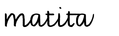

Fig. 6

Fig. 7

Fig. 8

Fig. 9